
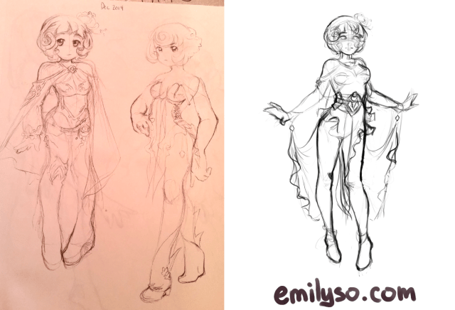
I didn’t know what to name this so Porcelain Iris (as in the flower) is what I came up with. Even though she has a bulb in her hair.

Iris because her outfit reminds me of iris flowers, and porcelain because of the colors I used. For the colors, I mainly took inspiration from Anna Dittmann. The concept of the character and outfit is from some old doodles I did in 2014 (on the left).
I’m not 100% sure of Anna Dittmann’s process, but I’m guessing she does the black and white version of her illustrations first then drops in colors with something like soft light blending mode layers. I’ve done that before, and it can be fun, but it actually kind of makes my head hurt. So I prefer to just jump right into working with colors and values at the same time.

I wanted to get away from “normal” colors and paint in areas with weirder colors, like magenta and blushy coral colors in dark areas to give a distinct aesthetic (so basically more secondary and tertiary colors). I don’t really know how to describe it. Normally in those areas I’d put some cooler colors like turquoise, blue or purple, but the magenta to me doesn’t make it warmer nor cooler. Perhaps someone can tell me different. This is probably especially the case because the highlighted areas in this illustration have a lot of cooler colors.
Here are some close-ups:


I kept working on this on and off for a few months, so I’m not entirely sure how many hours this took. Whenever I make illustrations like these, I pretty much always go through a phase where I’m absolutely despising the way the illustration looks in the middle of progress. Those times are hardest to work through because I know, as I tell my students, as long as I sit there and spend more time on it and push through those phases in my process, I’ll finish the piece and like it a lot more.
I want to try some more exotic palettes inspired by Anna Dittmann. It’s tough trying to come up with compelling lighting for interesting compositions.
Hooray for finishing more artwork!
