
At the request of my cousin, I’ve painted her portrait for her birthday. I haven’t seen her in almost a year, but I dug through my photo directories and worked with the best picture I could find. This photo is about 2-3 years old 😛

The tutorial idea was mine, though. I just always have this impulse to try and help to better educate children when I in any way associate with them. So this tutorial is more directed towards my cousin, Cindy 🙂
There’s so much that I can talk about in regards to portrait painting, so I’m mostly going to give tips and broad instructions. The rest of the “instruction” is me telling you this:
PRACTICE, PRACTICE, PRACTICE.
Here are some of the broad elements of portrait painting I’ll go over in this tutorial:
– proportion
– recognizability/likeness
– defining forms
– hair
Tools I used:
– GIMP (software)
– Cintiq tablet (hardware)
First step: Put the image in context by filling in the backdrop. Ideally mid-tones. Here, I kind of averaged out what was already in the photograph. (I did edit the photograph’s background myself to put Cindy in focus 😛 ) I used a very large brush with pressure sensitivity that effects opacity and brush stroke size.

Put the figure down in blobs. Use only solid mid-tones and a large brush size. I always start with a large brush first. I used a little bit of a grid to guide my proportions here. (note, I use dual-screens — my laptop screen makes everything brighter and wider, while my Cintiq screen does the exact opposite). Illustrate the figure’s broad shapes in broad strokes.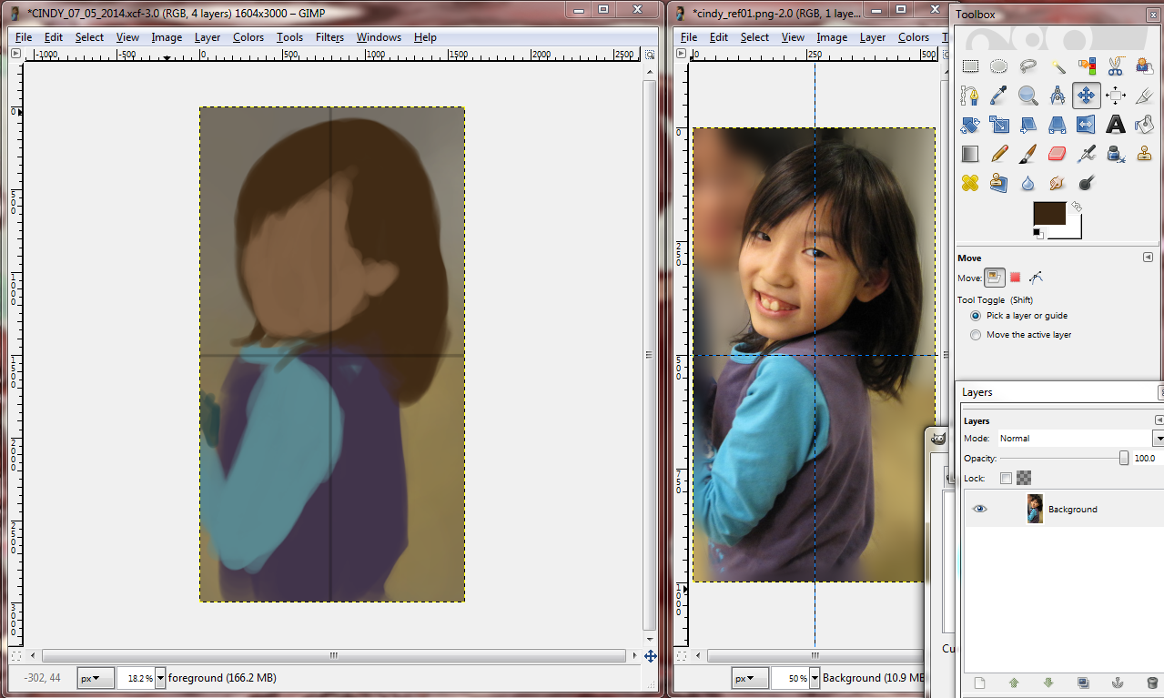
Use slightly darker and slightly brighter values to define the figure. Usually for the hair, after blobbing it out with the midtone, I make it pop by using darks. For everything else, I use a slightly brighter value to make the forms pop out (nose, cheeks, shoulder and so on). Use large to medium brush sizes. Don’t do any small details yet. Try to establish the placement of all the key features here. Doing this will help in creating a recognizable illustration of the person you’re painting.

Proportions are always tricky — the best way to simplify things in this regard is to use a full grid. Otherwise, as in my case, you’d be eye-ing everything (after many years of drawing and painting, that’s all you want to do, really…)
One of the key things to remember about proportion is once you’ve placed something, you’ve established everything else around it. A general rule, for example, is that the eyes are usually one eye-width (measurement of an eye from left to right) apart. Another interesting (mind-blowing when I learned this) fact is that your eyes are located in the middle of your skull/head (length-wise, top to chin).
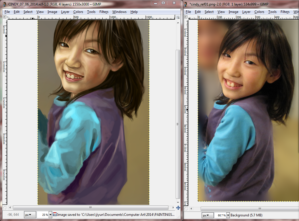
In this shot of my painting in progress, notice that I still haven’t used the smudged tool nor blurred/smoothed anything over. I’m still trying to establish values and likeness before I do the finishing touches. Use full range of brush sizes from this point forward.

I don’t ever use *black* or *white* (nor anything too close) in the early process of my painting. I always work from midtones and out, gradually working towards a higher contrast painting. Things look brighter when there’s more darkness closer around it, and vice versa.
In regards to color, black hair never actually *looks* as black as it is in the abstract. Same with teeth and eye-whites — they are never completely white. In this painting, I’ve used a grey-ish *blue* for the eye-whites, and for the teeth I’ve used a bright yellow/grey-yellow.
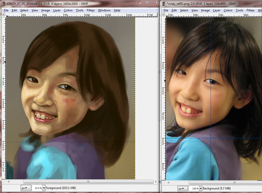
As I’m defining Cindy’s features, I’m taking note of what would make the painting look like her. The apex of her eyes, for example. Her left eye (on the viewer’s right side) has the apex further on our left, left of the iris. Showing how much of her iris is obstructed by her eye lids helps give the expression she has. Our eyes tend to narrow when we smile (otherwise we’d look kind of creepy).
For the shape of the head, more specifically the contour of her face and her jaw line, I figure out where the arcs and bends are by looking at where they are relative to the features of her face. For example, the width of her chin is about the width of her nose. The curve of her left jaw occurs around the height of her mouth. You can seriously do proportion checks all day… and for the rest of your life…

In this next shot, I’m just about done with the face, and now moving onto the hair. The first thing I do with it is finalize its silhouette, or the positive space it takes up. At this point it’s recommended that you make a separate layer on top of the face layer so you don’t mess up the face.
Special notes on hair: Hair is a prime example of our eyes vs. our minds. This is how many beginner artists draw their hair (I sure as balls did this myself when I was little):

The reason why we draw “spaghetti hair,” the reason we use *pitch black* for black hair or pure white for eye whites and teeth is because that is how we *think* of these objects in the abstract, in our minds. Assuming we are reaching for realism here, drawing and painting is about learning how to reproduce illusions so that you can trick viewers into thinking something you rendered looks “real.”
So hair is a great example of representing this. Yes, in the abstract, hair really is kind of like a bunch of “spaghetti” on your head. But the truth is, we do not see each strand of hair from down to the tiniest molecule. In this photograph, we see them in clusters, and the most detailed we get is some strands that happen to be hit and defined by light.
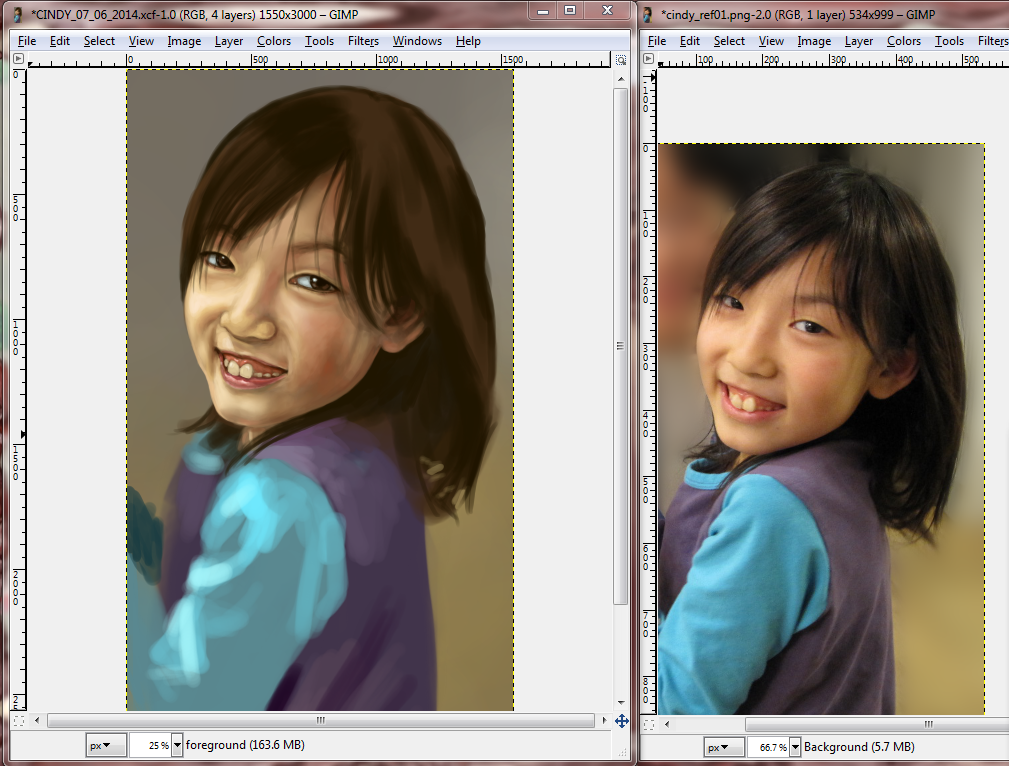
Define the clusters in blobs. Long, flowing blobs. The most interesting behavior of hair is demonstrated on the top of Cindy’s head. Look at the clusters and how they behave. There are some under others, some sitting on top of the rest. The clusters are separated by darker values, and are more defined by the highlights. Take note, I never use *pitch black* nor *pure white*. The highlight tones don’t have to be that much brighter than the mid-tones.
 Hair is tricky in that it has no anatomy — it has behavior. In the way that it sits on the head, in the way that each cluster sits on another, in its response to light. In rendering this photograph, I used a brown base. For highlights, I use grey-browns, grey-pinks and even grey-purples. After you’ve defined the general clusters of hairs, that’s when you start using smaller brush sizes. Notice how I don’t have that many brush strokes to define the strands of hair. This is because there is no need to define every bit of hair. You just need enough to make your point. For all the brighter values you use to make fine hairs, use darker tones and go over them a little to make them cast subtle shadows. Also, put a little frizz into the hair by making them go in sharply different directions than the rest of the hair to make it look more natural.

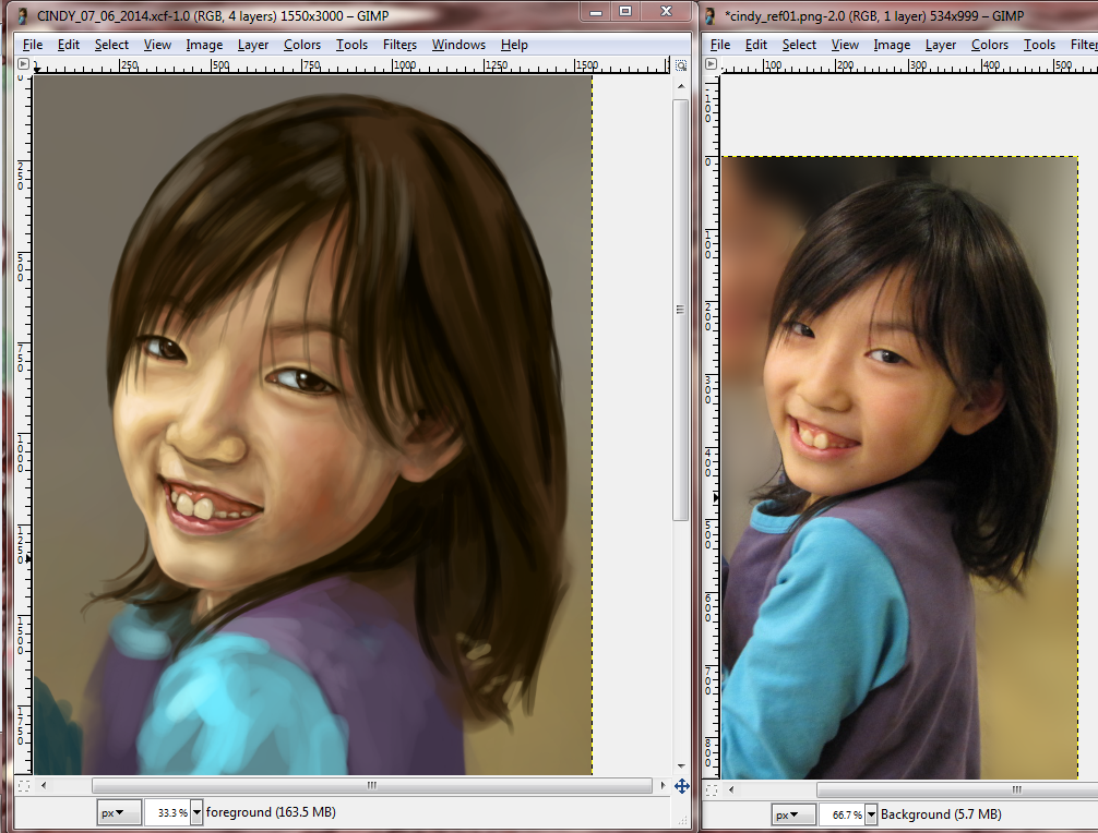
Lastly, clothes are another element of portraiture that is like hair. It also has behavior, though you could say it has some anatomy in that they usually hang over shoulders, drape off the back, people’s chests, and so on. In this case, Cindy’s shirt behaves in response to her shoulders. Observe the direction of the folds — they radiate from her shoulder and her back/shoulder blade.
In terms of values, it is more crucial here to work from mid-tones to darks and highlights. You’ll achieve more realism when you learn to control the gradients in the clothes, thus defining the folds and how the figure wears them.
I hope this tutorial has been helpful to all who view it. There is much that goes behind the rendering of a portrait — learning how to illustrate eyes, noses, mouths, putting all of those together, hair, and figuring out likeness. 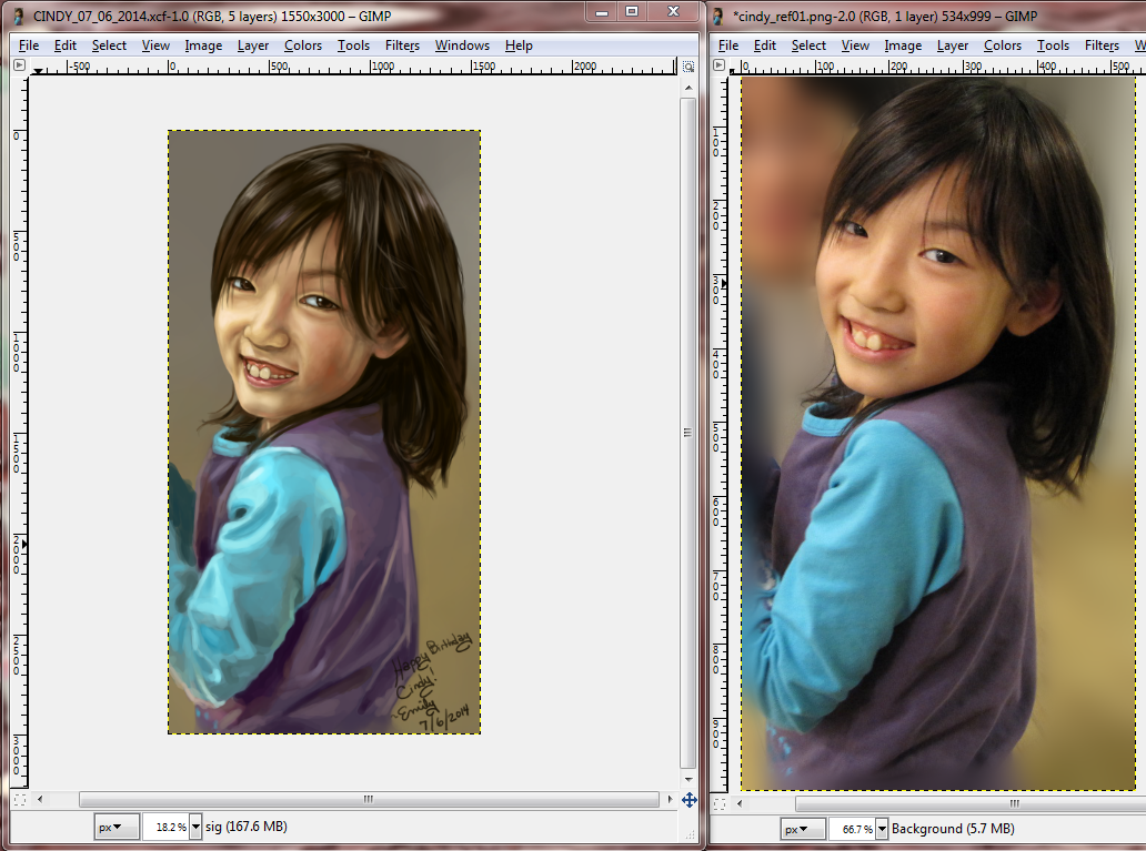 I’ve spent somewhere between 4-6 hours on this portrait. I figure the deadline is today, Cindy’s birthday 🙂

Again, there is no substitute for practice when it comes to drawing and painting. Observe, draw, observe, and draw. Rinse and repeat.
Happy art-making!
