other pages can be found here.
other pages can be found here.
other pages can be found here.
other pages can be found here.
 pages 1 and 2 are here.
page 3 is here.
Each of these comic pages so far have taken me somewhere between 4-6 hours.
And here’s a random doodle I did in Corel Painter X3:
 I think I should really play around with colors more. I like conte crayon in real life too.
My brother bought me Corel Painter X3 for my birthday. Thank you Anthony!!!!! He has the tendency to impulsively over-spend on random software (and occasionally, hardware…) for me. I’m so spoiled 😥 I don’t deserve my family. lol.
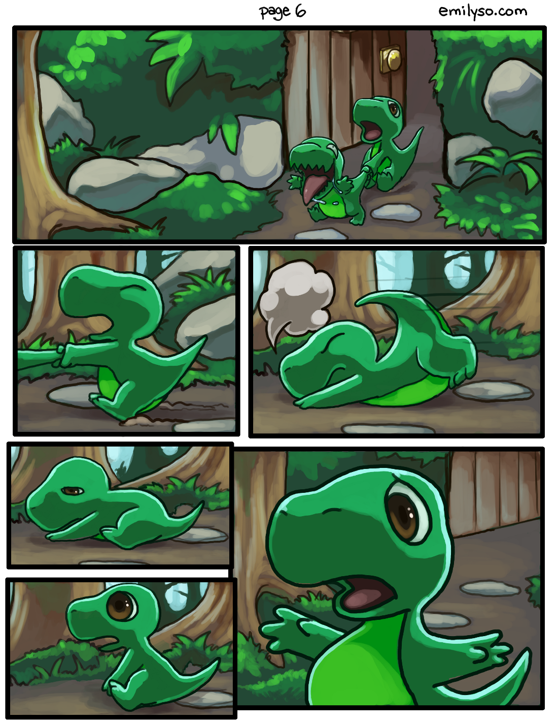
first two pages. This is an original story with original characters, based on the animation I worked on with a team back in college.


I’ve had this story planned out a while… I just need to push it out in some visual form, whether comic or animation. I figure comic is faster.
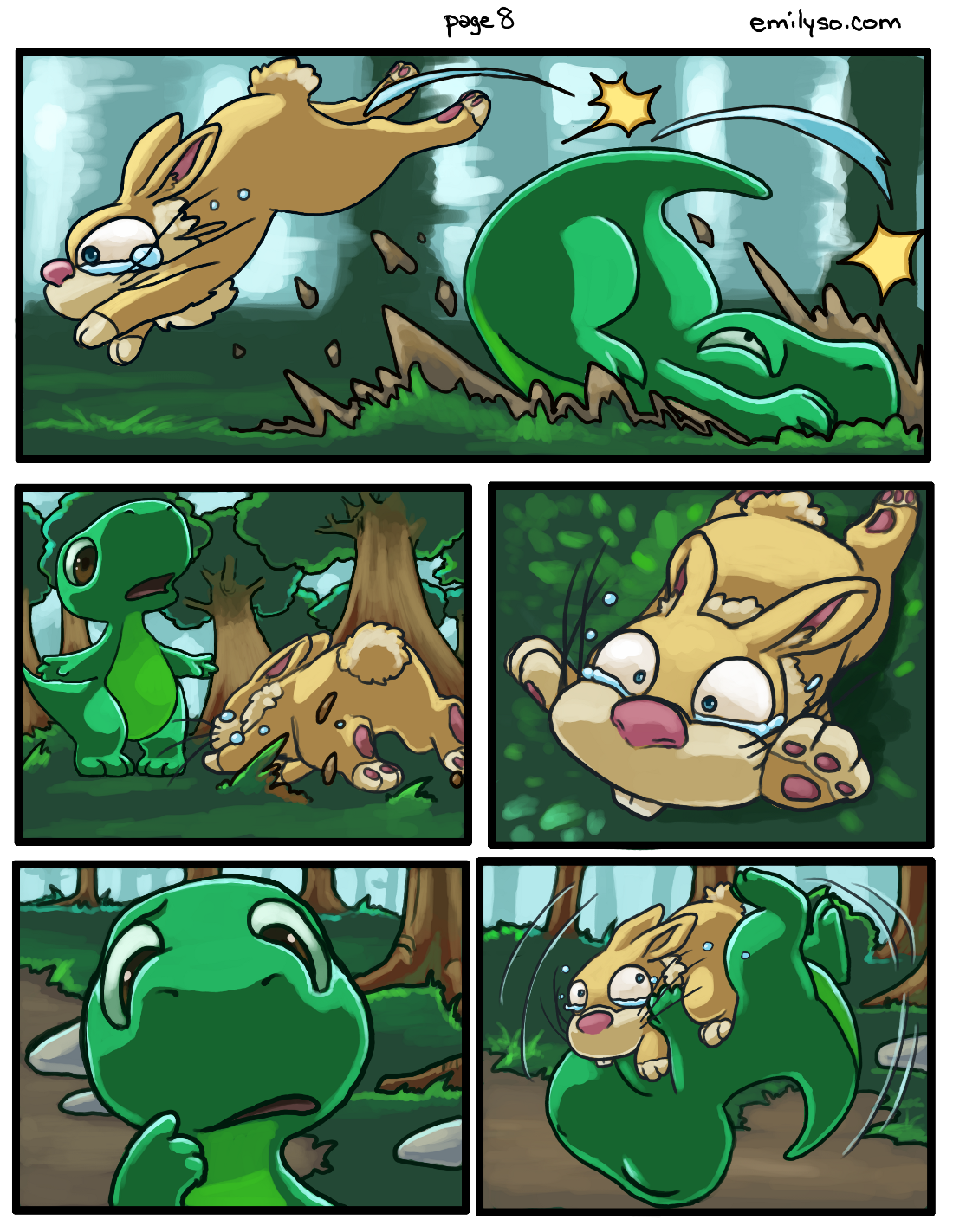
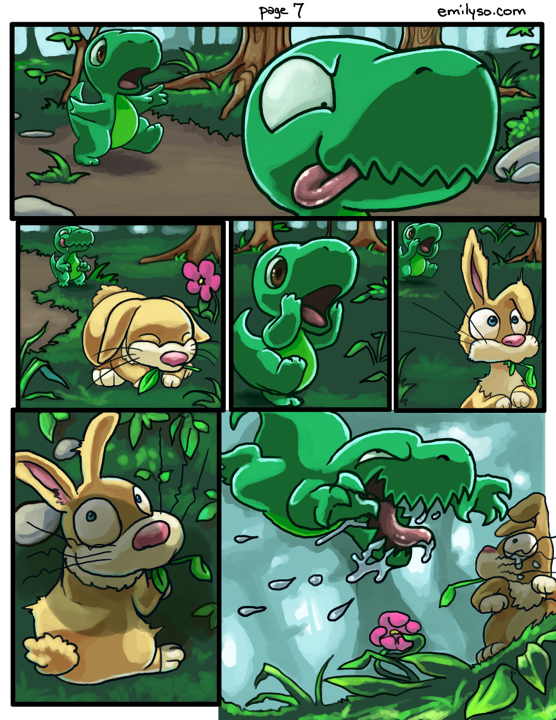
I also want to push out a page per week of Dinnersaurus. This is a continuous story from one page to the next. I hope it’s easy to get into :O
yaaaay. Thank you Jake (one of my clients) for the Adobe products.
About 4-5 hours of painting work.


 I went through a lot of ideas with this. It came from both ways — thinking of how I think of myself, and how the judges may think, based on last year’s winning entries.
So my thought process at first was dumb and cheesy. I wanted to be too deep and wanted to use way too much symbolism… and in the past when I tried that, I just kept spitting out a lot of cheese.
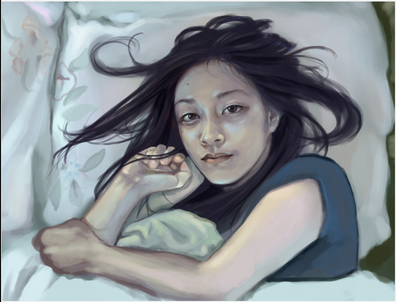
So I thought back to an actual oil painting I did in college, and someone said “This is the best painting I’ve ever seen you do.” and that painting was one I did of my bed — with just my sheets, blankets and pillows on it. It was pretty simple, but kind of said a lot.
In this self-portrait, I simply wanted to capture a moment that I tend to experience when I wake up. Well, many of us do this I’m sure. I stare at the ceiling. I space out. I let my mind go wherever it goes — whether I’m anxious about something, feeling guilty, wondering what I’d just dreamed about, or what I really wanted this painting to be about:
times when I stopped myself and said “Time goes by really fast, but I’m happy right now. Life is great for me.” Time seems to stop for that brief moment when I become that conscious and feel like I’ve stepped off the hamster wheel, even for a brief moment.
I really didn’t want this self portrait to be strenuous in any way. I didn’t want to give this one image so many expectations like making it represent “everything” about me. I think I need to chill out more. Just in general. About everything.
Anyway, it seems this contest is half based on a facebook popularity contest with VOTING… which works against me super hard, because I left facebook about 4 years ago. I really don’t want to rejoin facebook just to “use” my old friends like that *shrug* it just wouldn’t feel right.
Otherwise it’s up to the judges.
Worst case scenario I got another piece in my portfolio *shrug* what the hey.
Wish me luck.
This is my first documented tutorial ever. I think.

I figured tutorials for faces, human figures and so on are all very common and for now I just felt like doing something different but still interesting.
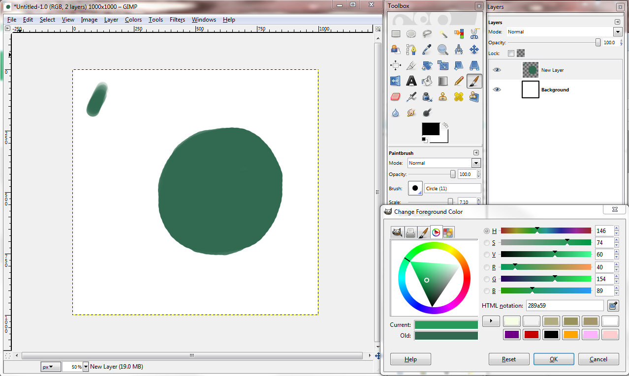
I completed the image editing in GIMP, using a Cintiq tablet with pressure sensitivity. You don’t need these exact tools — instead of GIMP you could use Photoshop, instead of a Cintiq you could use an Intuos and so on. Pressure sensitivity with your tablet would be great for this tutorial.
This tutorial emphasizes:
– depth
– textures
– free forms
Start with a midtone with the regular brush tool (hotkey P in GIMP, hotkey B in Photoshop I think). Create the silhouette of your form using full pressure. Use a medium sized brush to allow a range of sizes — make sure pressure sensitivity effects size and opacity of your brush.
 Pick your darkest tone. Try not to use black. Put some dark space onto your form. Use medium to light pressure.

Using your mid-tone, (in GIMP, hold control and color pick your mid-tone, in Photoshop I think it’s alt), use full to medium pressure to crawl in some shapes. Make it “manifest” from the dark like so:
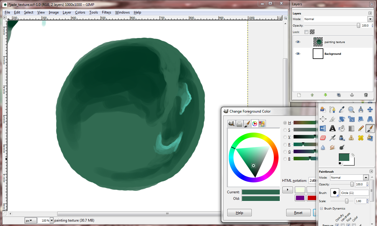
Pick a highlight color, but not too bright. Highlight the edges of the forms you want to have the most depth. Keep darks “in,” keep lights “out.”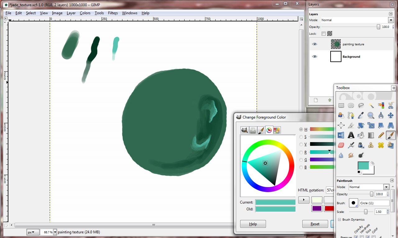
Let’s put in some more dark places for the forms to come out from.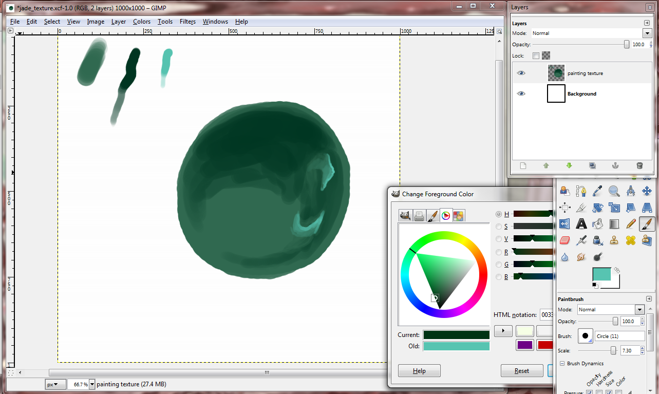
Crawl in again with your mid-tone from other mid-tone parts.
Make some “webs” with low to medium brush pressure. You can always color pick the tone between your mid and dark tone and do some more brushing with it.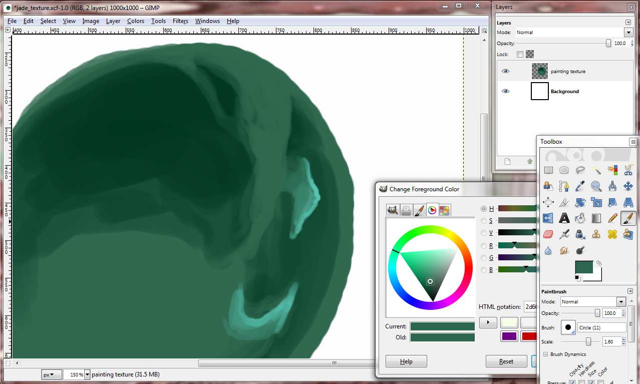
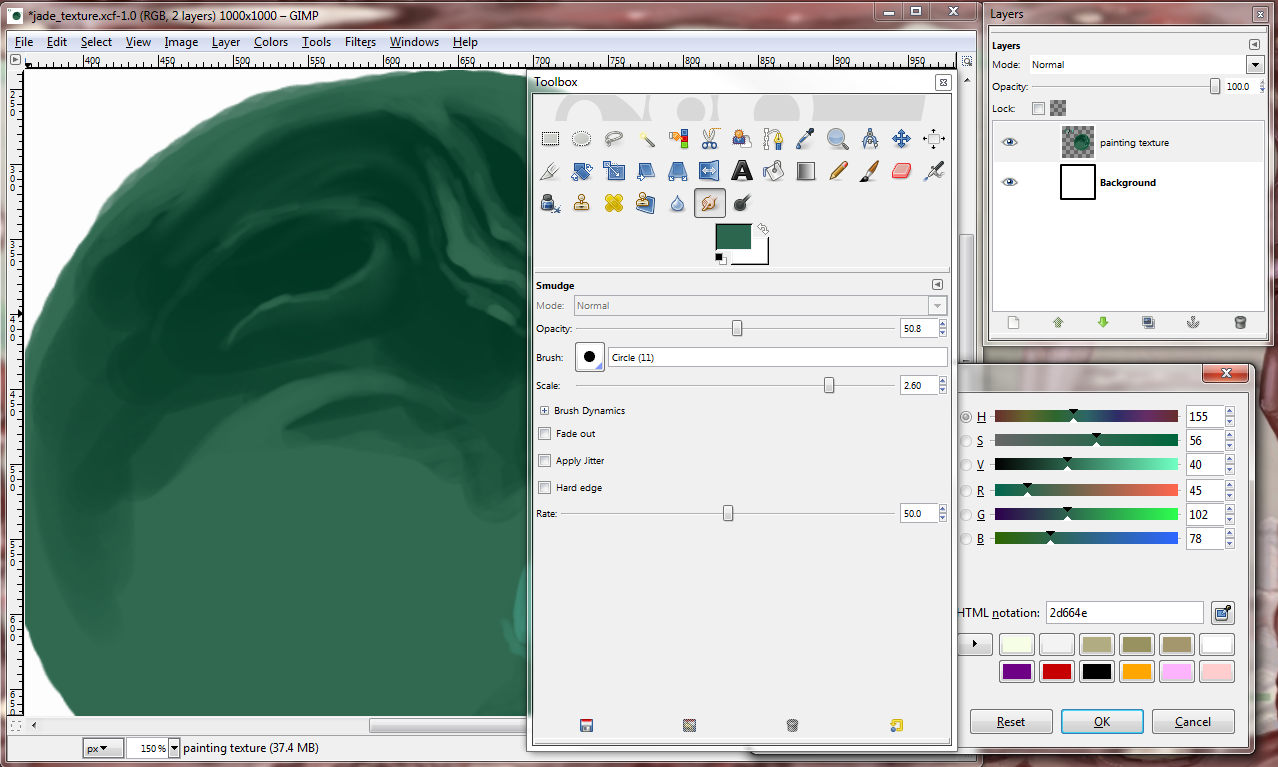
With your mid-tone, scribble in some folding forms like so. Scribble over your previous scribbles, and then taper off. Use full range of brush pressure. Brights “out,” darks “in,” like your wispy forms want someplace to hide.
Bob Ross is right about some things. This *is* your world. Make more wispy forms with the mid-tone wherever they’d make *you* happy.
I personally don’t go too crazy with the smudge tool these days (hotkey S in gimp), but in this painting tutorial, smudge/blend in mid-tones towards the dark. Leave the brighter tones sharper against the dark. We want these forms to look like they’re peeping out.
Take that highlight tone we used before and use it to highlight and define. Note: We don’t have to be so close to white when picking a highlight tone because what matters is the tone/value is *relatively* bright in comparison to whatever you’ve already used.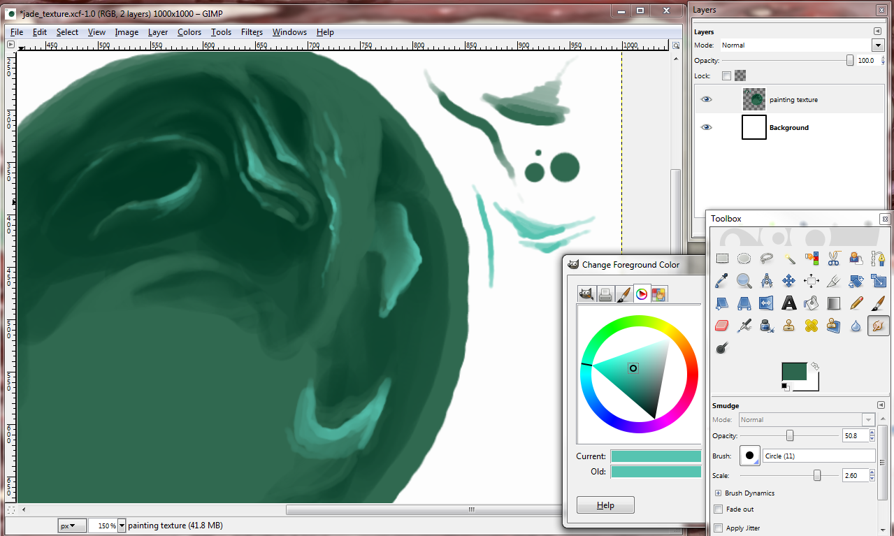
Compare the last image to this image right below in the color picking window. I picked a new highlight tone. It is not white, because it doesn’t need to be in order to still bring out our shapes. Use a smaller brush to sharpen the edges of your shapes. Tip: hotkey for changing brush size is “[, ]” (left and right brackets). 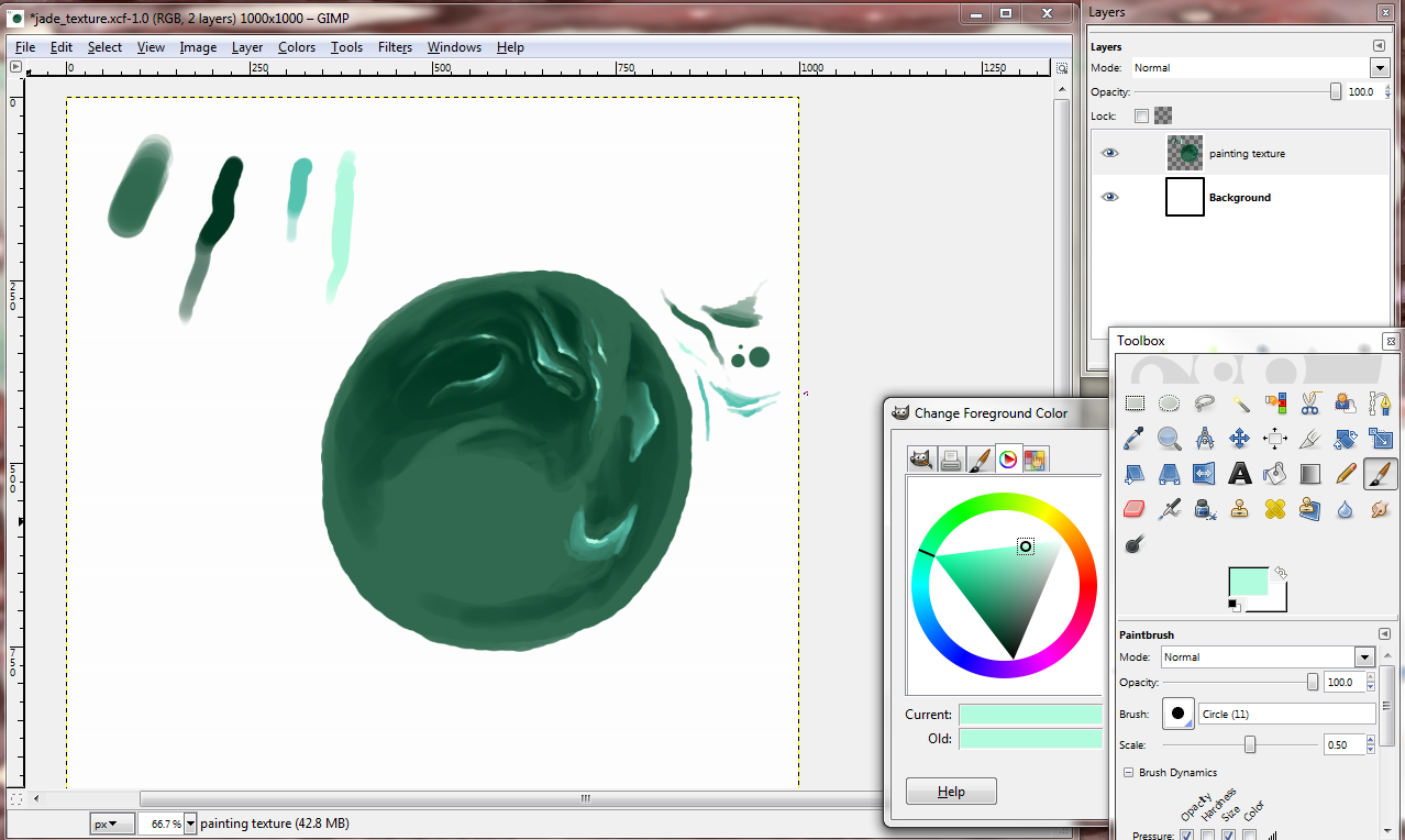
If you’d like to spice things up a bit, (I’m referencing a jade color scheme), you can pick a neon green and use it to compliment your mid-tones. Color pick between the two and blend them with the brush.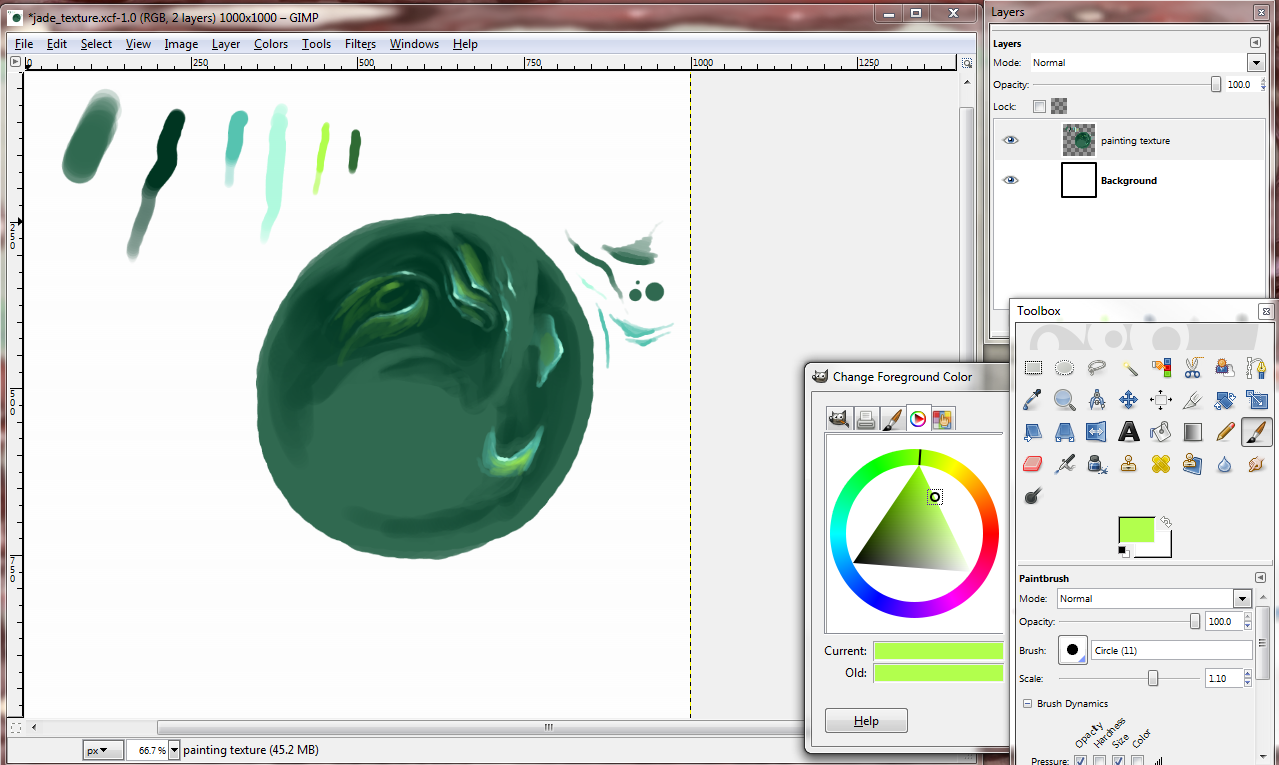
I smudged the mid-to-darks again. Then I took my dark tone and used medium pressure to create more dark spaces. 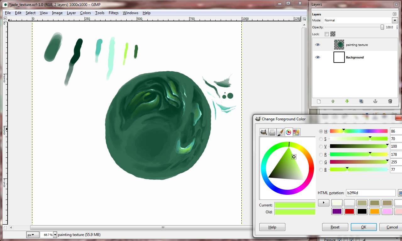
I used more pressure “inside” the lighter tone to create more depth. If you brush in dark tones right underneath the mid tones or highlights and leave hard edges, the forms will pop out more. 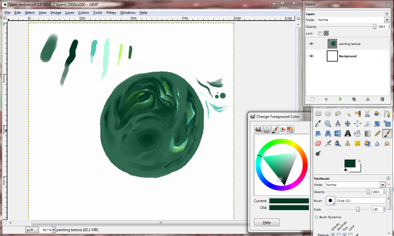
Highlighting and darkening around the mid-tones help to define our shapes.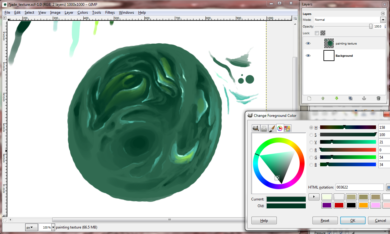
Lastly, we shall incase this place in a shiny container. Create a new layer. Make sure this new layer is on top, and that you’re now using this layer. With your lightest highlight tone, use medium to light pressure on the sides of your form like so:
Smudge. Then with full to medium pressure with your highlight tone, put in some rough dots to portray a glaze.
 I hope you found this tutorial helpful or at least made you happy. Thanks for reading my blog post!